
Parker
Overview
Parker is an application that helps find, provide information, and navigate users to parking spaces in the area. Users can search for parking near their destination in advance, or instantly look for nearby parking spaces.
Details
Duration: 6 weeks
Tools: Figma, FigJam
Role: UX Researcher, UX Designer, UI Designer

Background
As a frequent passenger of personal vehicles, I find parking to be the most tedious part of any journey, especially in a big city like Bangkok. When visiting new places with friends, I'm often tasked to help look up information on where best to park, and often struggled to find any details on the internet, and had to resort to calling the restaurant/café and ask them directly instead. This problem is even more prominent as I learned to drive myself, as the map applications commonly used do not take parking spaces into account during navigation.
Problem
In Bangkok, like many densely populated cities, looking for parking spaces can be very time-consuming, During rush hours, holidays, and weekends, places are often crowded, making the search for parking spots seem endless at times. This can take away from the excitement of enjoying the activity or locations that users look forward to.
Goal
This project aims to provide a simple solution that can greatly help reduce stress and wasted time, by allowing users to look up parking spaces near their destination in advance, or instantly suggesting nearby parking spaces as alternatives, along with providing important information to help users choose the best parking space for their destination.
Empathize
Secondary Research
Aside from the inconvenience and frustrations, In a busy city like Bangkok, Thailand, a massive amount of time and resources are wasted in going around in a parking lot, looking for an empty spot.

Up to THB 5 billion in fuels wasted

120 Million hours spent looking for parking spaces

276,000 tons
of exhaust gas
generated
Upon learning of these facts, I am determined to find a solution for the problem, which will not only help reduce wasted time on the users' part, but also make an impact on the environment as well.
User Interviews
After an internet research session and some quick chats with friends and family on this topic, I wanted to investigate further and learn more about this issue and how people are currently dealing with it.
Research Goals
-
Learn about users' experiences dealing with parking spaces at unfamiliar locations.
-
Learn about current pain points and frustrations of finding parking spaces in a busy city.
-
Find out what users usually do when they struggle to find parking spaces.
-
If/how users look up information on parking spaces before they start their journey.
Target Group
For the foundational research, I want to get input from both frequent drivers and passengers, as both are very likely to have dealt with parking issues in different ways.
Methodology
A recorded interview session via Zoom
Participants

Research findings
70% of participants do not research parking details for their destination in advance
When a parking space is full, 50% of participants will keep circling the same space, 40% will give up, and only 10% will look for alternatives
80% of participants will choose an alternative mode of transportation if they know parking is not provided
Users often get information about parking spaces of their destination via youtube reviews, or articles and travel blogs.
Street parking is an alternative, but is often unsafe and legality is hard to understand
When presented with options, users would rank distance, price, then safety as their deciding factor
Information on parking
spaces found on the internet is often outdated
Competitive Analysis
After learning about user behaviors and experiences, I decided to do a research on current solutions available for this problem.
For existing applications, I have found three websites that aim to solve similar problems. While each of them does provide good features, they are lacking in different areas and cannot fulfill user needs fully.

Looking through each website and application thoroughly, I identified the main functions that could be integrated into my application, and noted down features that do not work well as ideas for improvement.
Good
-
Find parking by searching for a certain location
-
Price and distance comparison
-
Links to Google Maps for navigation
Could be better
-
Most of the time, only partnered parking spaces are shown
-
Mobile apps available do not have a user-friendly design that is easy to navigate
-
No quick access to each for nearby parking spaces
Research Insights
From both the user interviews and competition analysis I have conducted, it can be easily concluded that:
finding parking spaces often takes a lot of time
Information on the internet about parking spaces is scattered and not very up-to-date
Street parking allowance is tricky to figure out
Users prefer parking spaces near their
destinations that are also cheap and safe.
Define
Persona
From the insights gained from my research, I created a persona that represents the main target group for this application

User Journey
Then, I laid out a user journey map for this persona to identify the main issues that can be improved.

Here, I noticed an improvement opportunity before the last two stages, where there are clear negative changes in user's emotions. Helping users find parking spaces quickly and easily during that small window can help make the journey much smoother.
Empathy Map
To get an even better understanding, I created an empathy map to explore user's possible actions and emotions in detail. This empathy map expands on the moment the user is circling around the destination, looking for a parking spot.

How Might We
How might we help users find parking spaces easily, to maximize their travel experience and reduce time and resources wasted while traveling to their destination?
Pain Points
Key Features
A lot of time is wasted when looking for an empty parking space
Instant search for parking near the user’s location
Users have to look through many sources to find the information they need
Clear comparison for important details, such as price and distance
The information found on the internet is often outdated
An option for business owners to add recommended parking spaces for their business
Street parking signs are hard to understand
and risk getting into legal trouble
Show clear information on the date and time that street parking is allowed
Ideate
After I decided on the key features that needed to be included, I started to plan out how users would navigate the application and use those features.
User Flow
Reflecting back to the user journey maps, I realized that there are two common user flows that I should consider. As most users do not look up information about parking spaces prior to their journey, it is important to allow them to so a quick search, and navigate to the location as quickly as possible.
(Click to view full images)

At the same time, users who are more prepared can look up information prior to their trip, or as they're about to leave by searching for the specific destination, and take time to choose the parking spaces they think is best for them.

I have chosen to link the application to Google Maps as opposed to creating an in-app navigation system to eliminate the possible confusion of users having to learn and adjust to a new system.
Sitemap
With the main user flow in mind, I planned out the site map.

Wireframe
To start, I picked out the main screens of the application and created a wireframe for the main user flow.
The key considerations I had in mind at this stage were:
1. Quick and easy access to information
2. Clear comparison of prices and distances

Design
As this application's main purpose is to quickly search and navigate to parking spaces, I used existing map applications as a reference. Having a similar structure as those applications will ensure effortless in-app navigation and minimize the learning curve for new users.
Logo & Identity
I've chosen the word "Parker" as the name as it is concise, straightforward, and easy to understand.
The logo is a map pin, altered slightly to resemble the letter "P" for "Parker"
The main colors used are blue, yellow, and gray, which are inspired by the commonly found blue parking signs, as well as the gray roads with yellow lines.


Design System
The main consideration for the design system of this application is to create a user-friendly interface that is clear and simple to navigate, highlight important details, and buttons are easily accessible.

Typography
Color Palette

Iconography

Buttons

Other Components

User Interface


Prototype

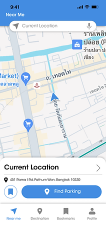
Find parking Nearby
When approaching a destination or struggling to find an empty space, users can instantly look up nearby options with just a tap.
Parking types and Details
The search results will show both private parking facilities and street parking availability, with important details such as costs and distance, and for street parking, if and when parking is legally allowed.


Look up destinations
For those who like to be prepared, users can also look up their destination in advance, then search for parking nearby, and bookmark the location for later.
Navigate via
google maps
When users select "Navigate", the application will directly link to Google Maps to navigate users to the parking location.

Test
Usability test
After the Hi-Fi Prototype was finished, I decided to do a round of usability tests to get feedback on the application for any possible issues. I had three participants from the initial interviews to try out the prototype.
Research Goals
Methodology
-
To observe how the user navigates through the overall flow of the application.
-
To see if users can successfully complete main flows with minor guidance.
-
Identify any issues that users might face.
-
Find improvement opportunities.
-
Qualitative Usability test
-
Moderated, In person testing
Prompts
I made sure to write prompts that will allow users to navigate through all the main user flows and important features intended for the application, which are:
-
Find nearby parking spaces
-
Look for street parking
-
Search Destination
-
Bookmarking parking spaces


Live Testing
I took notes of the user's reactions, as well as comments and suggestions they made as they navigate through the app, and asked follow up questions to learn more about their thought process.

Result Summary
Overall, users are able to navigate through all the flow easily. However, I do notice many subtle hesitations that users showed while completing prompts. I made sure to ask follow up questions to clarify any issues. This, along with participants' inputs reveals many parts of the applications that should be iterated on, as follows:

Test insights
Information present in the results should be relative to the user's whereabouts.
"Near me" page should allow users to navigate to parking spaces with minimal effort.
Bookmarks are useful, but the organization of the page is confusing.
Users usually go with the first result shown while
in a hurry, and don't tend to reach much details
Iteration plans
Then, referring to the insights learned from this usability study, I list out the changes to be made to ensure the best possible experiences for users. While there won't be enough time to make any more changes during the duration of this project, these are the changes I'd have made if there were more time.
The changes are sorted into different tiers of priority, depending on how much it would effect the user's navigation experience.
Priority 1: Will significantly improve user experience
- Increase the active area behind the "Back" button.
- Change the terms "North, East, South and West" to "Left and Right" when showing results for street parking.
Priority 2: Will be improve user experience noticeably
- Show parking results instantly in the "Near Me" when the app is opened.
- Reorganize bookmark page, adding the option to add custom names to saved places.
Priority 3: Nice to have
- Add more colors in pins and lines to indicate different types of locations.
Reflection
Challenges
This project was done as a pitching project for a boot camp, so there was a time limitation. It was quite challenging to come up with ideas, make decisions, and start prototyping within a short period of time. This rapid working pace, however, has come to be something I later appreciate, as it prompts me to use my time efficiently. Although the first version of the finished product had issues, it still allowed me more time later get feedback and make the changes changes needed.
What I learned
1. Consider the user's situation when they're accessing the application
As one of the main features of this application is to quickly find a parking space nearby, we have to take into account that users are using this feature when they're in their vehicle, either approaching their destination or struggling to find an empty space at their location. Because of this, it is important to design the user experience to be as quick and simple as possible, by providing voice search options and highlighting important buttons clearly.
2. Learn from existing products
I have looked at Google Maps a lot throughout the whole design process. As a commonly used navigation from a leading company, it can be trusted that every design decision has been deliberately made. Carefully looking at different parts and recognizing patterns have helped me make decisions on the design and organization of my own application more thoughtfully.