
AOP World
Responsive Landing page
Overview
AOP World's Landing Page was created to establish brand awareness and showcase their air purification technology to a global B2B audience, with plans for future expansion into e-commerce.
Details
Duration: 3 Weeks
Tools: Figma, Wix
Role: UX/UI Designer, Web Designer

Background
AOP World is a Singaporean company that provides healthcare solutions, specifically for clean air, to different businesses in various industries. Acquiring this cutting-edge air purification technology from China, the company wanted to rebrand their products for international audiences in time for a major event they're sponsoring.
Problem
With the main products being from China, under a Chinese company, AOP World needs to rebrand and reposition themselves for the global market, with focus on B2B clients in hope of establishing partnerships. They also have a very limited amount of time to launch the website for a major upcoming event.
GOAL
-
Use a website builder to quickly launch an MVP (minimum viable product) site that showcases the brand's credibility and and provides all vital information about the product.
-
Present the complex technology and display potential usages that will appeal to B2B clients
Day 0
Introductions
I was directly reached out to by the client for the duration of this project. Their Project Manager introduced me to their brand and gave me a quick slide deck to go through to get a quick grasp of the technology for the project

Client requirements
Here's a quick summary of the details I was sent:

Timeline breakdown
From this introductory email, it can be concluded that there is only 10 full business days to work on the design prior to the first launch, with five more days for final fine tuning before the actual launch for the event.

And so, a 15-day countdown begins...
Day 1
Meetings, Introductions,
and Research
During the first meeting, I was officially introduced to the Client via Google meet, where they gave me more context on the product, how it works, and their hope for collaboration with potential business partners. Here's a quick summary:

After the meeting, I spent the rest of the day going through their documents to get a more in-depth insight of the technology. I also kept in mind to look for and note down the information and media that would be a great addition to the website.
Client's Feedback
At this stage, the first thing they want us to do is provide a quick wireframe for the website. With a structure and clear sectioning with general ideas for possible content, this wireframe will help client write the relevant copy for the landing page.
Day 2
Research, sketches
I started the design process by doing a quick research, going through client's needs and references provided, as well as look up different well-designed landing pages and their patterns.
As the information is technical and quite complex, I soon realized that it is best to sort and organize the sequence of content into sections first, in order to be easiest to understand by client.

Day 3-5
Wireframing
Referring to the sketches I made, I turned them into digital wireframes and spent some time adjusting the content to best represent the brand and their product.
As no copy has been provided yet at this stage, I referred to the materials sent to use as reference for the information on the website

At this stage, the first version of the wireframe was ready, and no more could be done until further materials were provided, we have requested a quick meeting to go over the progress so far.
Client's Feedback
The clients asked for a partner section to highlight their past collaboration with global brands to highlight their experiences. Aside from that, they are happy with the structure of the wireframe, and will be using it as a guide to write the copy for the website.
Day 6
Design System, Mock up
Brand Identity
These images were provided by the client to use as reference to set the mood and tone of the website.
Their color scheme communicates cleanliness and stability, which is the way they want the website to come across as to potential customers and business partners.


Fonts

Typography
Color palette


Text Styles
buttons, Forms, and Navigation


Figma Mock Up
As soon as the design system was in place, I started working on the hi-fi prototype right away. This version was made quickly to serve as a draft to visualize how the design will turn out and determine if any adjustments on the text size and colors are needed.
Desktop
Mobile

Client's Feedback
The client has approved of the art direction and overall theme for the landing page, and have informed me that they will be sending over the first version of the copy over, This might require some changes in the wireframe.

Day 7-8
Wireframe adjustments
Wireframe - Version 2
The client sent over the first version of the copy, which I incorporated into the original wireframe
While the client followed the content structure I suggested, they also added some extra information as well, so there are some adjustments made to the layout.
At this point, I realized that we have come across a problem. The text came in large blocks, are hard to read and could disrupt user's experience. I promptly let the inform the client of this issue and suggest them revise or break down the copy into shorter, easier to digest paragraphs.
Client's Feedback
The client agreed that the copy should be shorten to help with the flow of the website and will edit them as I move on to wix

Day 8-9
WEBSITE CONSTRUCTION
I spent some time constructing the web page based on my designs on Figma. At this stage, the client was also working on polishing the copy, which results in quite a lot of changes in the design on my part. While the main structure was still intact, a some sections were removed and added as they requested.

Layout adjustments for mobile and tablet to accommodate all devices


Day 10
Design finalized
The final design is approved, domain connected, and the website is officially live!

Day 11-15
Testing, minor edits,
and final preparations
At this stage, the main layout and content of the website was finished, and it is time to support the client for the preparation of the event. This mostly involves correcting minor issues and make edits as the client requested.
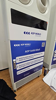
On-site displays
The client informed us that they have designed a display will be set up at the site to help advertise their company. This is where the QR code will link users to the landing page to provide information.


Final outcome

Click here to view the live landing page!
Photos from Client
Just before launch day, the client shared photos of the setup with us. When scanned, the QR Code will link users right to the website to learn more about AOP World.


Reflection
Challenges
For this project, time is the biggest challenge. With only two weeks to come up with wireframes, design system, mock ups, and a usable landing page, I had to be in constant contact with the client, and have to spend my time wisely.
Another challenge is the location of each party involved. While I'm based in Thailand, and the client is based in Singapore, original Technology is from China. While there are no issues with meeting via video calls and constant updates on Whatsapp, the main problem is file sharing. With no way of contacting the Chinese team for materials (photos, videos, and additional information) directly, the client has to step in and help with requesting the media needed for the landing page. In addition, with most major platforms being blocked in China, I had to spend a lot of time finding workarounds to get to the materials I need as well.
What I learned
With the extremely tight and challenging timeline, I had to approach the project in a completely different way. Unlike other UX/UI Design projects I have done before, this project taught me to be more flexible, adaptable, and be ready to respond to the client's needs and requests without it resulting in the delay of the outcome.
I also learned that there are no right or wrong way to do UX/UI, it's just the matter of understanding all the tools, process, and useful frameworks, then choosing to apply them to a project as needed. This is why I chose to present this case study in a different way too, as I thought that arranging them in a timeline can highlight the pacing, process, and decisions I made, that lead to the final completion of the project.